Implement Principal Components to measure Financial Crisis Impact
For those keeping an eye on financial markets, March 2020 likely stands out as one of the most turbulent times in recent memory. When the reality of the Covid-19 pandemic set in, along with the understanding that a quick resolution was unlikely, financial markets worldwide experienced a severe downturn. In the span from mid-February to mid-March 2020, the well-known SP500 equity index plummeted by 35% in value.
Concurrently, banks globally put a hold on lending, anticipating a wave of loan defaults. Governments across the world intervened, injecting money into their economies through measures like lowering reference rates or buying government bonds. To this day, the financial crisis triggered by Covid-19 is often compared to the Global Financial Crisis (GFC) of 2008/2009. Both crises were worldwide phenomena that significantly affected numerous financial indicators, including equity indices, credit spreads, overnight money market rates, and volatility indices. While many agree that the GFC of 2008/09 had a deeper impact globally the question remains - can we quantify this precisely?
Can we precisely quantify the impact of a financial crisis?
Financial Stress Index (FSI)
The answer is yes, and to achieve this we have at our disposal a metric known as the Financial Stress Index (FSI). FSI measures the degree of simultaneous co-movement of financial indicators - which is used as a proxy for an intensity of a financial crisis. This metric like many others used in the financial sector originates from the data science toolbox, as the main building block of the FSI is the Principal Component Analysis (PCA). However, it’s only fair to acknowledge that PCA, being a well-established algorithm, owes more of its lineage to traditional quantitative disciplines like statistics or econometrics. PCA is a technique used to simplify the complexity in high-dimensional data while retaining the patterns and information of the original dataset. It does this by transforming the original variables into a new set of variables, the principal components, which are orthogonal (uncorrelated), and which account for the maximum amount of variance in the data. For more information on PCA, I would recommend chapter 12 from this source
As the reader might assume already, we will use PCA to extract and concentrate information from a dataset of numerous financial indicators in order to build one metric - the Financial Stress Index. The FSI value quantifies the impact of a financial crisis and allows us to objectively compare any two periods of financial stress. Selecting the right financial indicators is a task that requires careful consideration, as the indicators should, in essence, reflect the critical sectors of the financial system. To ensure representation from the fundamental asset categories (including Equity, Interest Rates, Credit, Foreign Exchange, and Commodities), I have selected the following US financial indicators to build the Financial Stress Index:
- BaML US Corporate Master (IG) OAS - proxy for the credit risk of investment grade corporate bonds
- BaML US Corporate Master (HY) OAS - proxy for the credit risk of high yield corporate bonds
- S&P 500 Growth Index (SPYG) - proxy for the equity risk of US growth stocks
- S&P 500 Value Index (SPYV) - proxy for the equity risk of US value stocks
- US Treasury Note Yield 10 years (TY10) - proxy for the medium term interest rate risk
- US Treasury Note Yield 30 Years(TY30) - proxy for the long term interest rate risk
- USD-EUR Spot - proxy for the currency exchange rate risk
- USD-JPY Spot - proxy for the currency exchange rate risk
- WTI-USD - proxy for commodity risk originating from the spot oil price
- XAU- USD - proxy for commodity risk originating from the spot gold price
The snapshot of the dataset looks like this:
| Date | USD_EUR | USD_JPY | CRED_INV | CRED_HY | TY_10 | TY_30 | SPYG | SPYV | WTI_USD | XAU_USD |
|---|---|---|---|---|---|---|---|---|---|---|
| 2005/01/03 | 0.7428 | 102.72 | 0.830 | 2.770 | 4.220000 | 4.817000 | 12.010000 | 16.920000 | 42.220000 | 428.950 |
| 2005/01/04 | 0.7534 | 104.61 | 0.830 | 2.760 | 4.283000 | 4.879000 | 11.880000 | 16.760000 | 42.280000 | 427.650 |
| 2005/01/05 | 0.7540 | 104.09 | 0.840 | 2.800 | 4.277000 | 4.847000 | 11.870000 | 16.710000 | 43.340000 | 426.550 |
| 2005/01/06 | 0.7591 | 105.07 | 0.840 | 2.900 | 4.272000 | 4.854000 | 11.880000 | 16.790000 | 43.170000 | 421.320 |
| 2005/01/07 | 0.7660 | 104.80 | 0.840 | 2.910 | 4.285000 | 4.853000 | 11.880000 | 16.750000 | 45.520000 | 418.950 |
| 2005/01/10 | 0.7644 | 104.20 | 0.840 | 2.930 | 4.278000 | 4.827000 | 11.950000 | 16.710000 | 46.280000 | 419.120 |
| 2005/01/11 | 0.7626 | 103.37 | 0.840 | 2.930 | 4.244000 | 4.784000 | 11.910000 | 16.680000 | 45.330000 | 422.380 |
| 2005/01/12 | 0.7539 | 102.42 | 0.840 | 2.930 | 4.236000 | 4.771000 | 11.950000 | 16.690000 | 45.990000 | 426.120 |
| 2005/01/13 | 0.7565 | 102.41 | 0.850 | 2.960 | 4.187000 | 4.716000 | 11.800000 | 16.630000 | 46.840000 | 425.120 |
| 2005/01/14 | 0.7630 | 102.03 | 0.850 | 2.960 | 4.216000 | 4.734000 | 11.870000 | 16.670000 | 48.410000 | 423.150 |
Building the FSI
The data sample above comes from a larger dataset which spans from 2005 until 2022. The large time window allows us to build a continous FSI time series and compare the financial stress levels between any two points within that window. Below are the steps for building the FSI:
- Financial indicator values are standardized with a rolling window of 1 business year. Standardization is a necessary transformation before applying the PCA, and since the FSI is essentially a time series, we apply standardization within the rolling window.
- Signs of some standardized indicators are flipped, so that the increase in the value of the indicator leads to increase in financial stress
- For each row in the table of standardized indicator values we calculate a PCA transformation following the formula:

The above is a formula for the 1st principal component Z, where: W - the vector of transposed loadings of the 1st principal component, X - matrix of the standardized values of financial indicators, i - index of the financial indicator , t/T - the length of the series (the number of days). Z is calculated for every available time point (every row) and it measures the degree of co-movement of the standardized financial indicators - this is the FSI which we use as a proxy to measure financial stress.
Note that just like the 1st principal component is a linear composition of its dimensions, the FSI is a linear composition of its standardized indicators. We are therefore able to represent the FSI not just as a univariate time series, but as a multivariate timeseries of its constituent financial indicators. In graphical terms, we are able to represent the FSI not just as a single line chart, but as a stacked area chart, where the contribution of each financial indicator to the total FSI is represented. We can do that by plotting the standardized finacial indicators weighted by their 1st principal component loadings:
FSI time series from 2005-2022
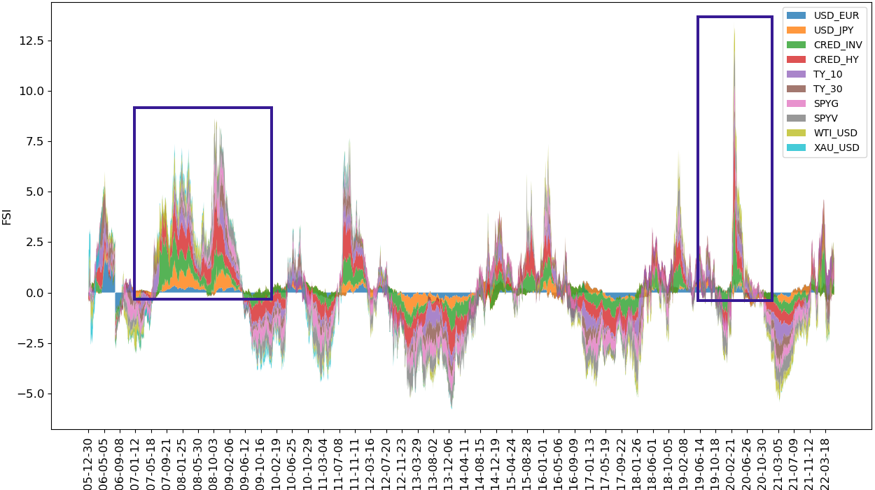
Interpreting the FSI
The FSI chart above displays the level and the constituents of financial stress at any point in time. The blue squares mark the Global Financial Crisis of 2008/09 (GFC) and the Covid-19 crisis of 2020. We can notice a couple of things:
- The GFC was less aggresive but larger in scope and impact than the Covid-19 crisis. The Covid-19 crisis peaked higher than the GFC, but it retracted fast, whereas the GFC protracted into many following quarters.
- FSI is build to revert around its mean value. The co-movement of financial indicators is either above or below the average co-movement value and therefore the FSI values can be negative.
To conclusively determine which of the two financial crises had a greater impact, we could simply compute or estimate the area under the FSI curve for both the GFC and the Covid-19 period and then compare these values.
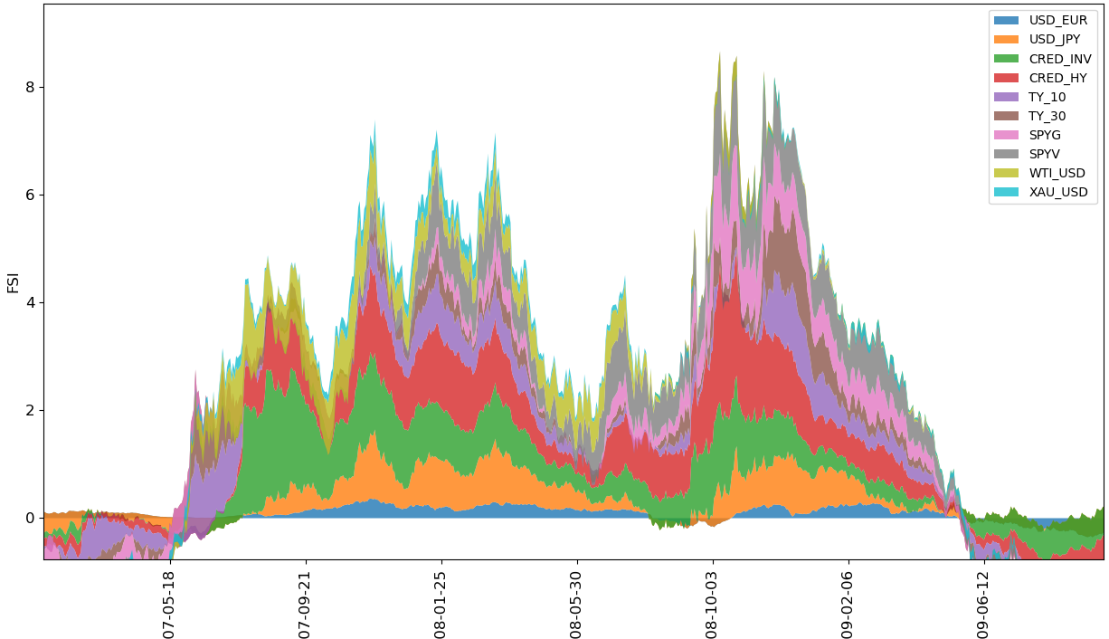
Upon closer examination of the charts, we can discern which financial indicators had a more significant influence than the rest:
FSI time series for the GFC
FSI time series for Covid-19
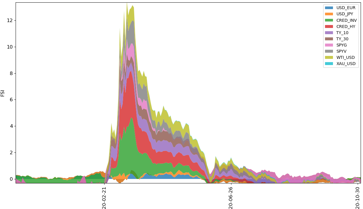
It’s unsurprising that credit risk dominates the area under the FSI curve for both the GFC and the Covid-19 crisis. In times of financial distress default risks tend to spike before other indicators, which is mirrored in widening credit spreads. The most notable distinction in the FSI’s makeup between the two crises is attributed to the USD-JPY exchange rate. Specifically, during the GFC, global investors held a more favorable view of the Japanese economy compared to that of the US, leading to a stronger Japanese yen against the US dollar. This pattern of investment behavior was not observed during the Covid-19 crisis.
An additional noteworthy point is that during the Global Financial Crisis, shifts in long-term interest rate yields, particularly the 30-year Treasury yields (TY_30), became pronounced only in the later stages of the crisis. A heightened TY_30 is indicative of growing long-term pessimism among investors, signaling that the crisis has escalated to its peak severity.
However it is important to keep in mind that the FSI metric very much depends on the choice of the financial indicators that are used to create it. The financial indicators should cover the most important aspects of a financial sector.
It’s crucial to note, that the reliability of the FSI metric is closely tied to the financial indicators that are included in its calculation. The selected indicators must accurately represent the critical aspects of the financial sector within the economy under analysis.
Conclusion
Dear reader, we have arrived at the end of this post. We explored the use of Principal Component Analysis’s remarkable capabilities to create a detailed yet adaptable metric for gauging financial stress. We have also seen how thanks to the nature of PCA, the FSI can be decomposed into its constituents, providing us with a better understanding of the drivers behind financial crises.
If this post has sparked your curiosity about the Financial Stress Index, I recommend reading more about the FSI topic here. Additionally, for those interested in the dataset or in poking around the code I used to create the FSI metric and the eye-catching visualizations, please feel free to check out my git project.